30TH SEPTEMBER 2019 - 7TH OCTOBER 2019
After the first briefing, I got 1:1 tutorial with Oliver on Monday 30th Sep. What I need to was thinking about the first project but I misunderstood because I forgot to read unit guide. I told him honestly I do not know what should I do and he gave some advice about first project.
After doing first tutorial with Oliver, I began to read first project contents and references on unit guide. At first I was interested in the system which made by coding rather than analog one. However, there was limit to create what I want. So I changed my mind to make by using drawing the system by hand.


Firstly, I set up the rules using 3 types of shape which were circle, rectangular and triangle. However, I found that the system was quite similar with another system which made by https://conditionaldesign.org/.
So I changed again using three colours of lines and dots. When I made the rule, I wrote down the sentence "draw the curve" but tutor said there are a lot of types of curve. It means the curve could not be draw what I expect. He recommended to experiment with my rule in order to see the result because I can see my problem through running my system. I changed "draw the curve" to "draw twisting curve/line" and I asked my peer to run my system. She drew the line but it seemed like pig tale. I had difficulty to express what I want because of my low level of English, and she was willing to help me. Finally, I got final rules of system and I ask 10 people to carry out. Some of them were confused about "curve" so I showed my example.


My system was carried out and they made of a myriad of pattern. They seems quite similar with each other but different. It was very interesting because of different colours and shapes of lines. I think I got good result and it was good experiment.
On Monday 7th October, we got presentation and it was good time to see other peers' work and their process of works. Some made by using code based on we learnt last Wednesday in coding seminar. They also used screen shot code Oliver taught. Some works seemed regular and some were not but they were interesting. I want to try to make the system by using code next time. Because it looks like graphic art. Before making project 1, I wonder how the system relate to art so it was really good time to try making work which I have not experienced.
After the first briefing, I got 1:1 tutorial with Oliver on Monday 30th Sep. What I need to was thinking about the first project but I misunderstood because I forgot to read unit guide. I told him honestly I do not know what should I do and he gave some advice about first project.
After doing first tutorial with Oliver, I began to read first project contents and references on unit guide. At first I was interested in the system which made by coding rather than analog one. However, there was limit to create what I want. So I changed my mind to make by using drawing the system by hand.


Firstly, I set up the rules using 3 types of shape which were circle, rectangular and triangle. However, I found that the system was quite similar with another system which made by https://conditionaldesign.org/.
 |
| Before modification |
 |
| After modification |
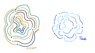
So I changed again using three colours of lines and dots. When I made the rule, I wrote down the sentence "draw the curve" but tutor said there are a lot of types of curve. It means the curve could not be draw what I expect. He recommended to experiment with my rule in order to see the result because I can see my problem through running my system. I changed "draw the curve" to "draw twisting curve/line" and I asked my peer to run my system. She drew the line but it seemed like pig tale. I had difficulty to express what I want because of my low level of English, and she was willing to help me. Finally, I got final rules of system and I ask 10 people to carry out. Some of them were confused about "curve" so I showed my example.


My system was carried out and they made of a myriad of pattern. They seems quite similar with each other but different. It was very interesting because of different colours and shapes of lines. I think I got good result and it was good experiment.
On Monday 7th October, we got presentation and it was good time to see other peers' work and their process of works. Some made by using code based on we learnt last Wednesday in coding seminar. They also used screen shot code Oliver taught. Some works seemed regular and some were not but they were interesting. I want to try to make the system by using code next time. Because it looks like graphic art. Before making project 1, I wonder how the system relate to art so it was really good time to try making work which I have not experienced.
댓글
댓글 쓰기