기본 콘텐츠로 건너뛰기

OnlineExperience [Design]


After choosing Pacman as my theme, I watched playing Pacman in order to refer to the website design.


1. Main Page

At first, I just put 'Privacy&Security Ver.' on the right lower but it looked not good because I used fan shape of the logo. For Pacman animation, I put them closely and I did not put any speech bubble and text.

First, I give the margin each ghost because they were too close. In order to explain to the target audience, I thought it will be great if I put short text on images so I experimented with just white text. But it was hard to see the text.

So I gave the border on words and it looks more clear. However, when I gave an animation left to right and following Pacman, it was strange to read in order. Because people usually read the text left to right but the animation is moving left to right and the first ghost nearest Pacman is the yellow one. ( I cannot explain why it is strange But )  I think it would be easier to read if I changed the directions to right to left and reverse images.


And I finally got this outcome.


2. Second page


At first, I was going to put them Pacman in the middle and moving both sides to look like Pacman cannot escape and put Ghosts outside of the box but it did not look good. So I made ghosts gif images watching four sides.


3. Third page ( I do not know why each screen-captured images has deleted after third pages)


As I said on storyboards, my first idea was Pacman eats cherry and leave traces, and ghosts eat data or watch with licking lips. However, I changed the outcome. I used the blue colour of edge on rectangular like the map in the second page.


4. Fourth page


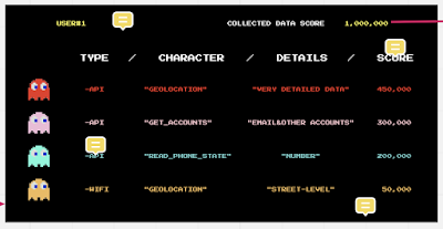
The first design was just to show the lists of character, name and wrote each ghosts' name "Hangeul" instead of Alphabet, "FFBB" instead of Facebook, "BLUEBIRD" instead of Twitter and "MICAROHARD" instead of Microsoft. I wanted to give humour with changing the original company name to ridiculous name. But I deleted name section and add type, character, details and score. And on the top, I put user's information which is user1 and his/her collected data score.


So, this is the second draft for the fourth page.


However, every time I made the page, I considered where do I need to put the button for going to the next page. And my peers, Kim and Veva, also gave me feedback about the button. Gareth and Oliver also said it would be better if I put explanation about geolocation/get_account things.


So I changed the button from '1,000,000' which is collected data score on the top to ghosts buttons. I also put a speech bubble to let the audience know there are the buttons. And put hover speech bubble on every character and put hand images which induce mouse over.


5. Last page


I made this ghost looking like wants to eat more data. But the content in the last page is about the reason they eat/collect data. So I put money pixel inside of pupil. First I put Dollars pixel was green because dollars are the green colour. But I want to show they are looking for money and data which is yellow dots. So I changed the colour green to yellow and I changed the body colour to mix all ghosts. I wanted to use four colours but it looked not good when I use four colours and change the colour of the inside of the mouth to black/white one, so I used three colours.


I used the gif image on the last page since I failed to use code moving coins that I was inspired by one of the websites tutors gave us. It was hard to give a floating effect on the place I wanted because I used another code in the middle of the page. So I used photoshop and used gif image on the background image on the last page. 


댓글

이 블로그의 인기 게시물

Feedback and changes

   [ from mid point presentation ]  I asked 4 questions in the midpoint presentation. Which one do you think good/convenient for users to count the number?(on my sketch) - The reward/benefits section will be a good method to get more people using reusable cups - Hi Min! I think the staff one and scanning the qr code is quite convenient. People counting by themselves might mean people cheat and over exaggerate how many times they've used it  Merge 1&2 100% - I'm not sure, I can see the dilemma, merge 1 & 2 would mean people can't exaggerate (would using one qr code that everyone scans in the store better than a sticker, to save paper?), but if people make their own drink then they can't enter the use, so I would say 3 might be the best I guess you could merge 3 and some elements of 2 as having a qr code could remind people to enter their use when they are in the store - I think it's difficult to have users count their uses themselves. It might be best for ho...

Initial Design + Changes

 1. Start Page [initial] [modified] I changed the first page because the initial one was too simple. I want to highlight the main colour of Ncup by using the colour on the background. 2. Login-Sign Up [initial] [modified] I added sign up and sign in button on each sign in and sign up apge. 3. Register cup  [initial] At first, uploading the photo was just optional, and I wanted that users can see the photo before clicking 'done' button. But I got feedback from Armando that it looks more proper on the web, not the app. So I changed the button. [1st modified] I changed like the photo above, like big plus button and cancel button and put 'preview' function. But I did not like it. [final] It is the final design. While modifying the design and function, there were some changes in function. Like it is no more optional to upload the photo of tumblers. Because I thought staff in cafe need to check the tumbler image when they scan it. And I coloured green on the top background. 4...